I’ve been looking around for business cards and this one certainly struck a chord with me. Graphic designer Ken Miki
created this 3D business card based on his precise coordinates on
planet earth: latitude 34° 41’ 23” and longitude 135° 30’ 44”. The card
starts off as a 2D piece of paper but then easily folds together to
become a 3D cubic model of the world. It’s a subtle way of kicking off
the conversation. Nice! click to enlarge
Source: Ken Miki’s website
New print release! Our last of the year! Jenny Kim created this beautiful print out of charcoal and abstract coffee-colored washes. Now that New York City finally feels like winter, Coffee Deer feels like the perfect print release, with the barren landscape and the quiet dignity of the deer. I love the contrast between the abstracted ground, and the detail of the deer.
Jenny chose to pair her print with Puppies Behind Bars.
I’ve always had a soft spot for dogs, especially service dogs. I see great value in training dogs for the disabled or explosive detection canines for law enforcement, and also in the contribution these dogs make to those people in need of their service, love, and companionship.
Read our interview with Jenny here, and buy the print here. We will be back on Tuesday, January 3rd, 2012, with a new print edition. Enjoy the holiday and thank you for all of your support of The Working Proof in 2011!
New print release! I’ve been a longtime Skinny laMinx fan – what’s not to love about graphic illustrations and bold colors? So, I’m thrilled to bring you this week’s print release by Heather Moore – Seeking, a screenprint that began as an illustration cut from paper. Seeking makes me feel like I’m getting a peak into a jungle somewhere – lush vines and plants, and filled with wildlife that are both hidden and visible, if you know where to look.
Being from South Africa, Heather wanted to choose a charity that has a positive impact on her continent, so 15% of each print sold will be donated to the Jane Goodall Foundation. Read our interview with Heather here, and buy the print here.
New print release!Chevron Repeat is a beautiful exercise in pattern and technique by Sasha Prood. In Sasha’s words:
Chevron Repeat is a piece from a larger ‘watercolor meets pattern’ study. In this study I was exploring the juxtaposition of order – the geometric shape in repeat and disorder – the imperfect quality of watercolor. What I enjoy most about painting with watercolor is that as much as you work to control it, there is always an unpredictable aspect in how it will dry.
Dance Party is an awesome print by Heisuke Kitazawa, an illustrator that I have long since admired, ever since spotting his wallet series for Poketo. Dance Party is about how we coexist with others. It expresses how Heisuke feels about communication:
Animals or humans it's all the same. It's all about sincerity - how we treat others and not about knowing the language or other communication methods.
This is a digital print on acid free, Neenah uncoated matte 100lb cover paper that is 80% recycled. It was digitally signed by the artist and was numbered by The Working Proof. 15% of each print sold will benefit Puppies Behind Bars. Read our interview with Heisuke here, and buy the print here.
Pictogram Movie Posters by Viktor Hertz.
"This is an ongoing project, that just got started. So, count on lots of additional work in this project, in the future.
What I do, is that I make a quite simple movie poster, including one or a few pictograms, displaying the theme of the film..."
Graphic design studio Eding:Post has announced that Leaf Letter, a joint-project between themselves and Neo Green, a retailer of planters, books and other green paraphernalia, has gone on sale as of March 1, 2011.
Yesterday was the first day of spring, and Unplug is a celebration of the changing season. After a long winter of hanging out indoors and spending a lot of time in front of a computer screen, it's time to unplug and go outside! I love the sentiment (and need the reminder!). The print, by Hollie Chastain, was originally created for a group show centered around a modern take on the Works Progress Administration posters of the 1930s, promoting health and safety, travel and educational programs. The artists involved with the group show were challenged to create a poster with a modern message, Hollie's being that there is always more adventure and beauty in nature than we can ever find online.
Whenever the opportunity presents itself, here on S&T we love showing student work (see thesethreeposts, for example) for 2 reasons. First, because there’s so much talent to be unearthed. And second, because they are the ones who really need the exposure!
Beginning next Tuesday and running through the whole week is Sotten, Tokyo University of the Arts’ senior thesis exhibition. The main arena is the Daikanyama Hillside Terrace where, interspersed throughout the duration of the exhibition, there will be special events featuring notable alumni such as art director Michihiko Yanai (perhaps most know for his Tower Records slogan “No Music No Life) and musician Keiichiro Shibuya. But, after all, it’s all about the work. So below are a few hand-picked favorites.
These are sadly sold out, but I love them too much not to post them here - illustrated cards by Karolin Schnoor. Each card can be transformed into a puppet/animal figure. So sweet!
The West Wind is a new print by Patrick Hruby that was inspired by a story his mom read to him when he was a child about the four winds talking to one another. Patrick always daydreamed about what each of the winds might look like and what they would say, and this print illustrates what he imagined the West Wind to look like. 15% of each print sold will be donated to Doctors Without Borders, an organization that Patrick feels represents what it really means to be human in the best sense of the word - that we put our love for our fellow human being above our allegiance to a country.
Also, The West Wind is featured in Readymade's December/January issue, on stands now, in their Shop to It feature! Hope you can check it out!
The West Wind is a new print by Patrick Hruby that was inspired by a story his mom read to him when he was a child about the four winds talking to one another. Patrick always daydreamed about what each of the winds might look like and what they would say, and this print illustrates what he imagined the West Wind to look like. 15% of each print sold will be donated to Doctors Without Borders, an organization that Patrick feels represents what it really means to be human in the best sense of the word - that we put our love for our fellow human being above our allegiance to a country.
Also, The West Wind is featured in Readymade's December/January issue, on stands now, in their Shop to It feature! Hope you can check it out!
Buy the print here, and read our interview with Patrick here.
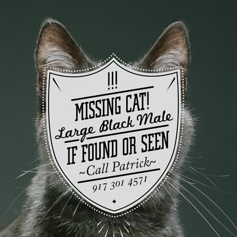
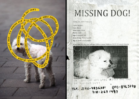
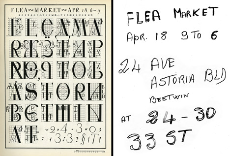
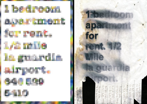
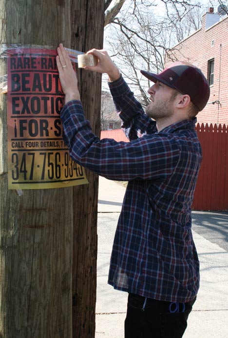
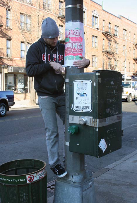
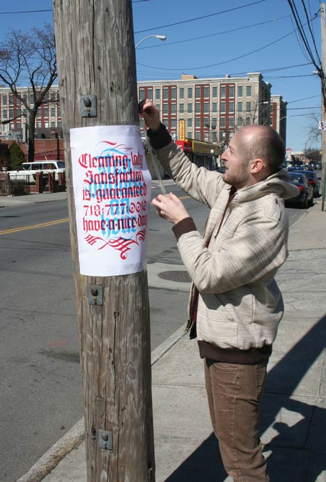
New York graphic designer Cardon Webb collects fliers and hand-written notices from his neighbourhood and replaces them with his own re-designed versions.
Calling the project Cardon Copy, Webb uses exactly the same wording as the original notice, whether for a for a missing pet or garage sale, but adds his own imagery and graphic style.
The new posters are then displayed on the street alongside the originals.
Here are some more details from Webb: Cardon Copy, takes the vernacular of self-distributed fliers and tear offs we have all seen in our neighborhoods. It involves hijacking these unconsidered fliers and redesigning them, over powering their message with a new visual language. I then replace the original with the redesign in its authentic environment.
I started Cardon Copy as an experiment to demonstrate the power of visual communication. It also gives me a venue to create and express myself, allowing me to combine my art, design, and typographic ideas. By considering, then altering, such things as color, composition, image and type to a common street flier with a message as simple as, “I lost my cat”, the transformation is interesting.
The message changes, though the content is the same word for word. Is the new visual language helping or harming the message? Will products sell better, ads be answered more? Are people more inclined to notice the message, but not necessarily trust it? What demographic will answer an ad for an apartment for rent that is hand written in marker, as opposed to a well designed printed poster? It is interesting to note how the medium and design of a message can affect the success or failure of its communication and purpose. My hope is to open up this type of conversation.
Cardon Copy is meant to be slightly facetious. There is something comical about seeing familiar street fliers presented in such and elaborate way. It is important to note that I am not dismissing these found humble fliers, trying to rid the streets of ugly signage. The fact is, that I appreciate the original fliers, aesthetically and conceptually.
Because of this I only redesign fliers that there are multiples of. This way both the original and the redesign or Cardon Copy exist in the community together, to compare and contrast. I like to think by doing this in some way I aid in the discovery of what is often neglected.