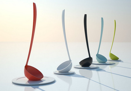
The tate otama is one of those objects that are so simply they’re genius. You think to yourself, why didn’t I think of that?…exactly. The tate otama, which we can ascribe the simple translation of “stand-up ladel” to, is precisely that. The designer flattened the bottom, allowing for it to be easily stored, as well as easily accessible while in use. And yes, the inside remains rounded. Designed by Mikiya Kobayashi, the tate otama is currently in production and should be available shortly in all its wonderful colors!


No comments:
Post a Comment