Designed by: Barbara Loomis
Linksource: www.fashionoffice.org
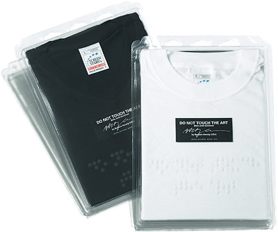
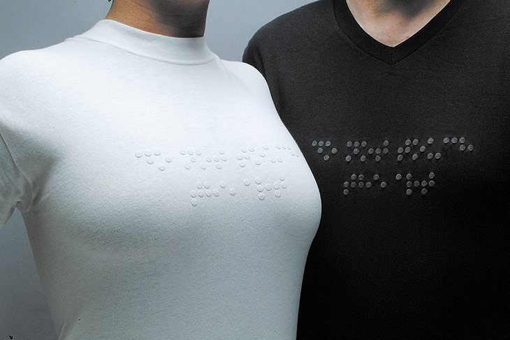
The design of this tee-shirt is very unique, trendy, and contraversial, at least to most of us, that is. What is imprinted on the breast area of this tees actually the braille words of "Do not touch the art." For the blinds, however, reading does requires them to touch with their hands!


As shown on the picture above, the braille words were placed strategically on the breast area. It's meant to intensify the message, yet placing the words there simply means the area will be more susceptible to readin...hmm... I mean.. finger fiddling. =)


Awesome article! I want people to know just how good this information is in your article. It’s interesting, compelling content. Your views are much like my own concerning this subject.
ReplyDeletePommeaux de Douche